Hanabi Redesign

One of my favorite games is Hanabi. It is a game of logic and deduction and has a cool firework theme (Hanabi is Japanese for “firework”). If you haven’t played it, I highly recommend you try it out. You can purchase it on Amazon here. Given I play the game quite frequently, I wanted to see if I could make a better deck of cards to play with.
Goals
- Print the game on plastic cards (instead of the traditional, laminated paper cards that come standard) so they are more durable, shuffle smoother, and have a better overall feel.
- Maintain large numbers in each corner for easy visibility.
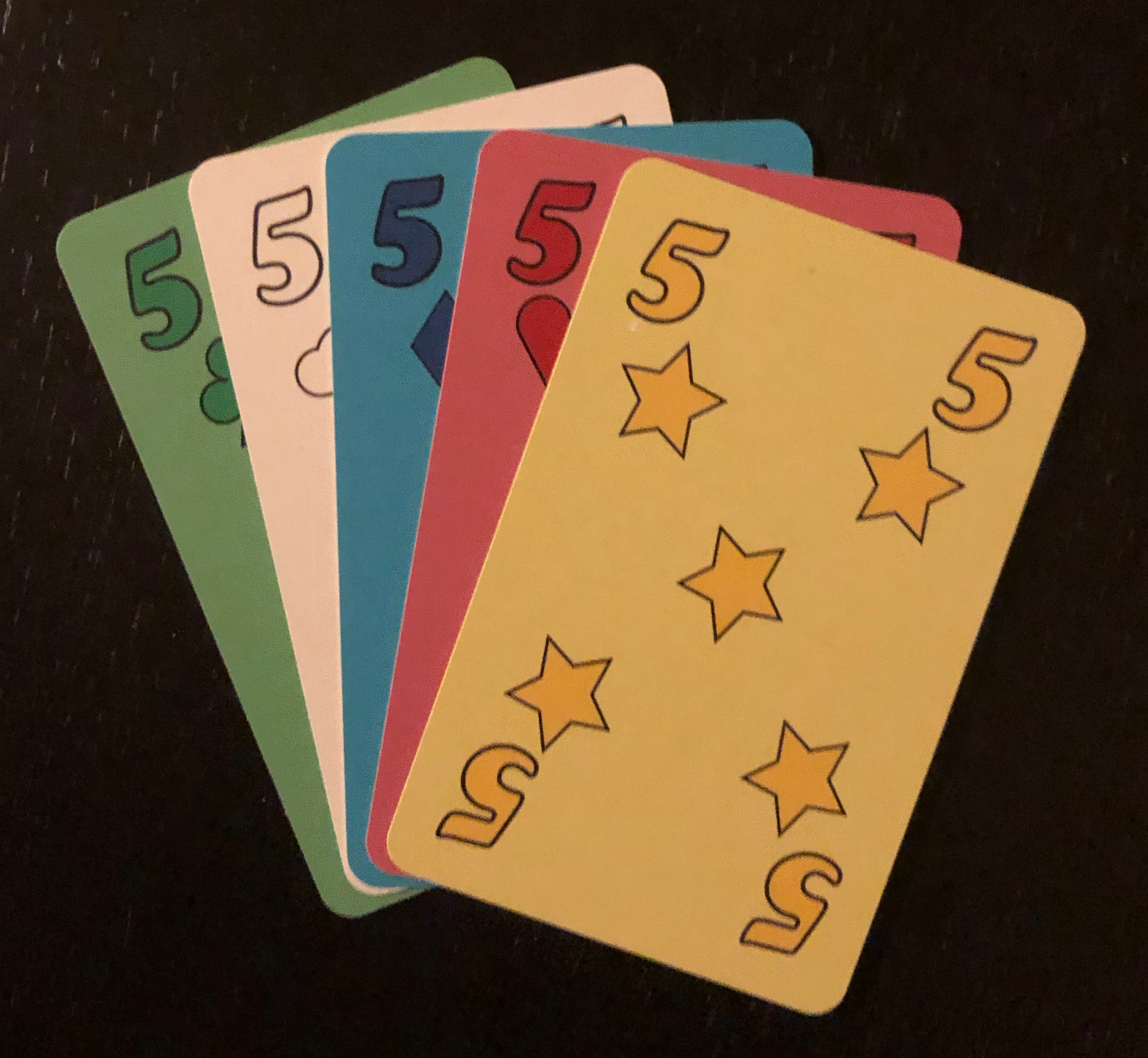
- Make the card color more apparent (The standard game cards are primarily blue with only small amounts of color in the numbers and firework graphics) to ease in gameplay. I’ve played many games of Hanabi where, due to distance and/or poor lighting, it is hard for players to determine what colored cards are in other’s hands.
- Improve the clue tracking mechanism.
- Experiment using design tools such as Adobe Illustrator. Since I’m not a designer, I have little experience using these tools and thought this would be a good project to get my feet wet.
Process
I didn’t want to print the cards myself and deal with the poor quality my printer would yield so I opted to order them online from makeplayingcards.com Since they handled all the printing, I just had to make sure I created files in a format they supported (.png) so that I could upload them to the site.
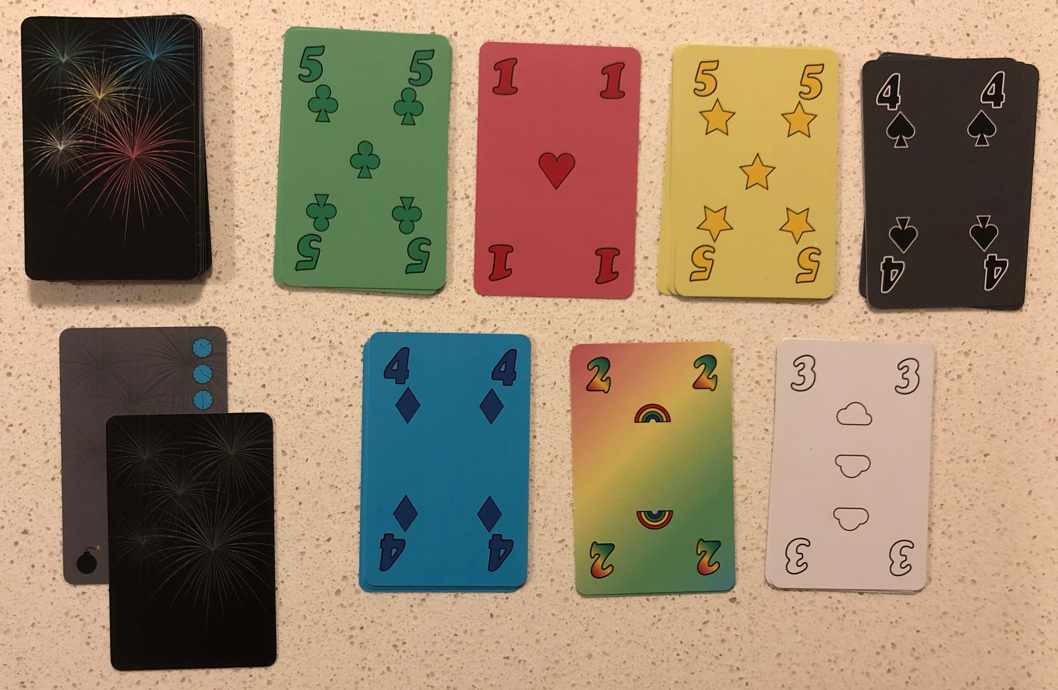
For the design, I decided to go with a simple design reminiscent of traditional playing cards. Although less visually interesting than some nice firework graphics could have been, the simplicity of the designs makes the cards very functional for game play. I chose to use the standard four playing card suits (hearts, clubs, diamonds, spades) while also adding additional suits. Since Hanabi relies on the card color, I couldn’t use red for both hearts and diamonds or black for both spades and clubs. Instead, I chose to color these suits as I have seen most common in other four-colored decks by making the clover-like clubs green and diamonds blue while leaving hearts and spades red and black respectively. The original Hanabi game doesn’t have a black suit so I could have used this to replace white or yellow but instead chose to include all three. Having an extra suit enables playing some additional game variations and seemed to make the design more complete.
I needed to choose pips to go with the white, yellow and rainbow suits. The choice for rainbow seemed obvious…rainbows. For white and yellow, I wanted symbols that naturally corresponded to those colors but could also be represented as simple shapes. I settled on yellow stars, which I’ve seen in other 5-suited games like Five Crowns and white clouds. In addition to being simple shapes that fit with the other suits, clouds and stars seemed to work nicely with the celestial nature of rainbows.
With the suits decided, I went about designing the icons in Illustrator. I used simple geometric shapes and worked to make them of consistent dimensions when possible (e.g. the rainbows and clouds are the same width as the stars and hearts) Given their similar form, I also ensured the designs were consistent between the clubs and spades such that they could be overlaid and line up perfectly. Although not strictly necessary, I like the consistency this provided. After finalizing the pips, I looked at traditional playing cards to determine how to arrange the symbols on the cards for each number. Because the suit symbols are not strictly required for the game, I chose not to include these below the number on each card. This gave me some more room to work with for the main layout since I wanted to keep the numbers relatively large so they could be easily read across the table.

I applied the main colors to the numbers and symbols on each card while using a lighter version of each color as the background. Having the cards in full color makes them much easier to identify when playing. In addition to being large, a thick, black stroke (white for spades) was added to the numbers to make them even more readable.
With the main cards done, I had two more design tasks. The first was to create the design for the card backs. For this I chose to stick with the fireworks theme and created fireworks of different colors on a black background. Although I tried to ensure symmetry in the design of the card fronts, I wanted the backs to have a clear top and bottom. This was done to aid in gameplay as I often flip cards upside down when information is given to me as a memory aid.

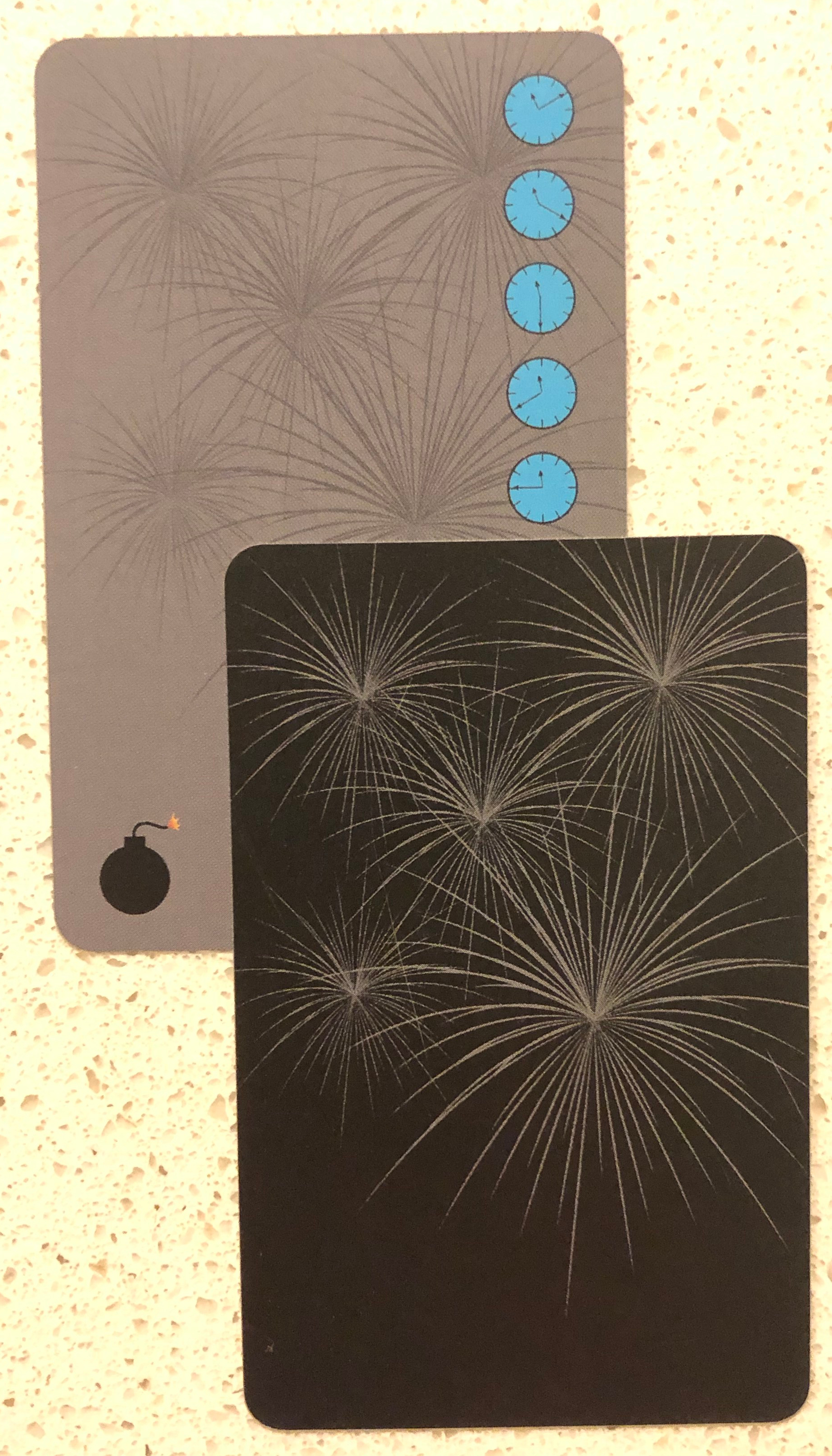
This card indicates players made one mistake (bomb) and have 5 clues remaining
Lastly, I determined a layout that would allow players to keep track of the clues and bombs used using a simple "card cover-up" method instead of requiring the tokens used in the original game. Although the tokens are nice and tactile, they are difficult to transport and easy to lose. Using cards to do this tracking allows the entire game to pack up in a simple card deck with no other pieces needed. The clock and bomb images for the clue trackers were a bit tricky but after some persistence, I'm satisfied with the result.
Overall I am quite pleased with how the cards turned out. They work well for game play and accomplished the objectives I set out at the beginning of this project. Although you won’t get the durability of plastic cards, you can download a printable copy of my cards and test them out for yourself.

